For many years, users of MyHeritage have requested a pedigree view of their family tree. For a subset of family historians who use this type of horizontal view in their research (standard in many other programs) the vertical family view they offer was somewhat unpleasant to work with.
However, MyHeritage seems determined to improve their platform in nearly every way possible and they have finally decided that a pedigree view is important. If you already have a family tree on MyHeritage you can access this new view on just about any device immediately. We’ll show you how below.
Please know that we have partnered with MyHeritage to bring you news and updates about their services and we may earn a fee to support our site if you choose to purchase a subscription after clicking on a link from our site.
First, what is the MyHeritage family tree?
MyHeritage, like Ancestry, offers a free family tree as a way to encourage people to take advantage of their online record services, and millions of people host their trees this way. To use their family tree you can set up an account on their homepage or download their free family tree program – but if you want access to their almost 9 billion records and their discoveries engine (which is akin to Ancestry’s hints) then you will need a paid subscription. They do offer a free trial here.
How can I access the new pedigree view?
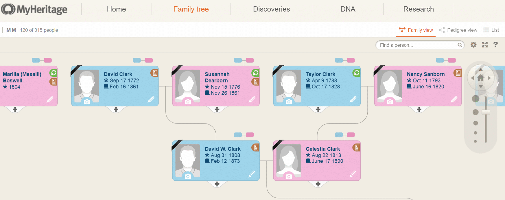
Here’s a screenshot of what the current family view on MyHeritage looks like. For those who like this method of presenting genealogical data, it works well. Clicking on any person opens a panel to the left that will allow you to edit details.
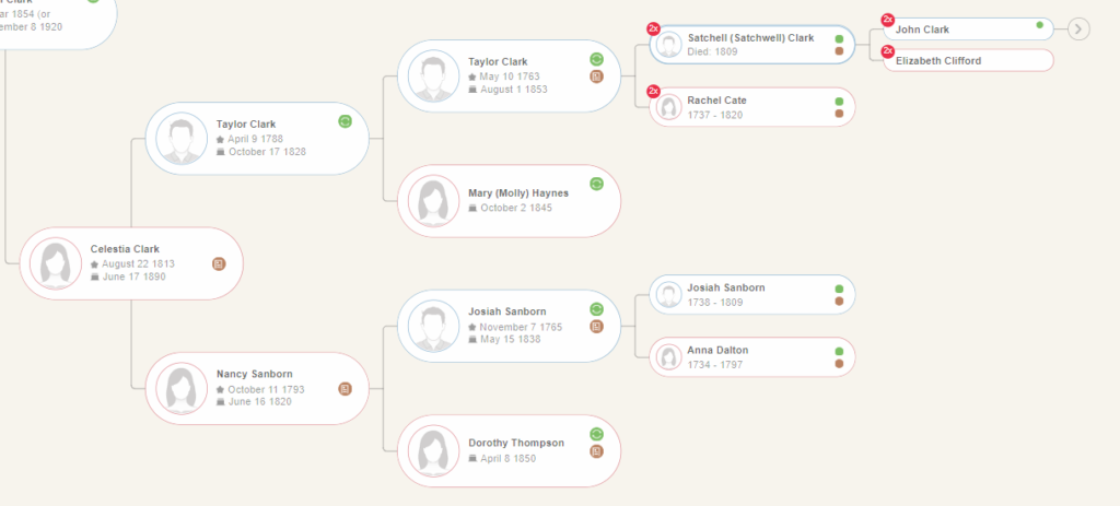
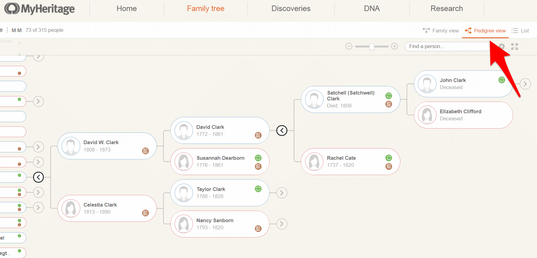
The new pedigree view, seen below, looks quite different, but its format will be familiar to those who have used this method of viewing family history data with other sites or programs. As you can see, you can switch to this view quite easily in the upper right corner of your tree on both desktop and mobile views.
The design is simple and attractive but, as MyHeritage points out in their blog post about the new feature, it does not have the same functionality as the family view quite yet.
When you click on an ancestor you will be presented with a panel on the left side of the screen but, unlike with family view, you won’t be able to edit your ancestor’s information directly in that panel. You will need to visit the person’s profile that is linked to under their name to make any changes.
This is an extra step if you’re trying to make a quick edit, but it’s hardly a deterrent. The new pedigree view is so much easier to use for those who prefer this style that it makes the extra step worth it – and MyHeritage does plan to add more functionality in the future.
One thing that we really like about the new pedigree view is the immediate access to records and smart matches right from an individual’s tree entry. If you click on the green circle (Smart Matches in other people’s trees) or the brown record (historical record matches) you will be brought directly to the information. Of course, you will need a paid subscription to access most of these records.
For those who have never used MyHeritage before, these discoveries are similar to Ancestry’s hints, as mentioned above. We provide a complete walk through for using their discoveries engine here. and you can read all about other sites that offer record hints in this article.
Do you prefer pedigree or family view in your research?


